
In an increasingly paperless world, corporate print materials require more thoughtful consideration than ever. That’s because their effectiveness no longer depends primarily on what they have to say, nor on whether audiences are eager to hear it. It depends on whether the piece of paper in a person’s hands has won their consideration.
We’ve seen our share of outstanding – and not so outstanding – corporate print jobs. For all their peculiarities, the most effective of them tend to have certain things in common. Here are a few we think are especially important:
- Intriguing and attention-grabbing. Your audience needs to immediately see value in taking the time to read it. Try a bold headline that asks a question related to one of your audience’s pain points – something similar to, “Is your company ready for a data breach?” Or make a simple statement that your audience would care about: “1 in 10 of our city’s children have no place to sleep tonight.” If your headline works, you’ve won your customer’s attention and a few more seconds of their time.
- Simple, large-face type. Keeping a customer’s attention can depend on offering concise, easily digested information in clearly articulated, audience-appropriate language. Once you have your messaging laid out, you’ll want to display it attractively. For larger portions of text, Serif fonts are especially readable on the printed page, and you might consider scaling your type down as you go: larger type for the most engaging first sentences, followed by somewhat smaller type for the technical details. In both cases, use the largest type you reasonably can, and break long paragraphs up into subtopics or bullet points. If you find you have to use small type just to get all your information to fit the page, then you probably need to revise the content to include less information at this touch point.
- Uncluttered, visually engaging layout. A well-designed print document has a natural visual “flow.” A nice graphic catches the eye, which then follows to a clear headline, through some informative text, perhaps over to a helpful illustration, and finally down to a clearly delineated call to action. Well-laid-out documents use the negative space on the page to bring visual contrast to the most salient parts of their message. Resist treating blank areas of the page as an open invitation for more content. Too many graphics or too much text in one place can make your page feel cluttered and “busy.”
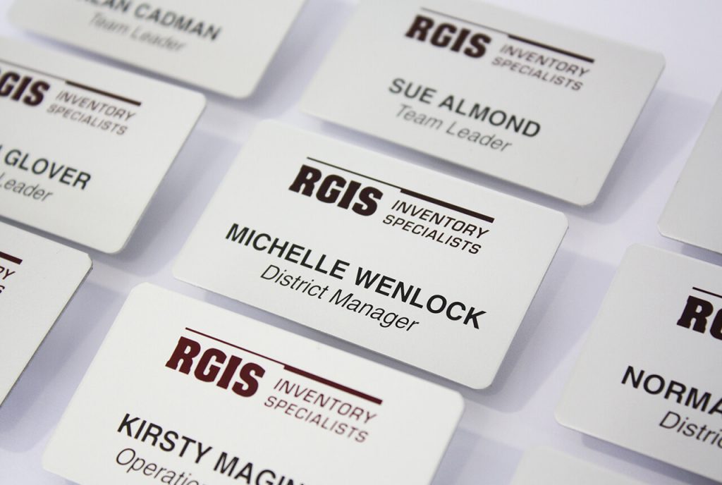
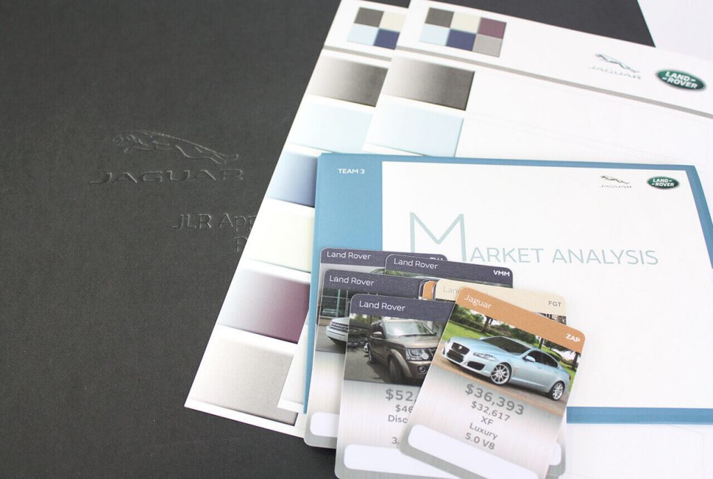
- High-resolution graphics. Images, company logos, and in-line illustrations are highly impactful additions to your printed materials, but give due thought to the files you incorporate. Photos ideally will have a resolution of 300 dpi. Vector graphics are more print-friendly than raster graphics, and while large electronic file sizes are cumbersome on the front end, they usually make for more attractive final products when printed.
- A clear “next step”. Decide in advance what outcome you want from your print material. Is it to have your audience get in touch with you by phone? To visit your blog (where you’ll convince them with additional information)? To visit your company in person? To donate money to a cause? Whatever the case may be, your call to action needs to be crystal clear and visually set out from the rest of the content. It should be obvious at a glance to any interested member of your target audience what they need to do to take the next step.
With over 30 years’ experience, we are specialists in effectively communicating corporate messages across a diverse array of print media. Our expert team is eager to help your organisation get the most out of its print campaign. Call us today and we’ll be happy to put our skills to work on your next project.